This is a rare and welcome survey, since too much policy attention is focused on income - whether in terms of taxation or inequality - whereas assets are a much better indication of the social health of a society. The graph indicates how unequal the distribution of wealth is according to deciles of the population. So the first bar represents the poorest 10%, the next bar the next poorest 10% and so on, up to the 10% who hold the most assets. It includes physical wealth (like cars and washing machines) and property wealth, as well as potential wealth, like pension plans, and actual savings.

Asset inequality, as measured by the Gini coefficient (where 0 is perfect equality and 1 perfect inequality), varies between different kinds of property. The gap between the richest and poorest was least in terms of actual stuff (0.46) and greatest in terms of cash holdings (0.81), with pension savings (0.77) and property wealth (0.62) coming somewhere in between.
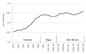
The greatest weakness of the report is that it is a snapshot and includes no trend data. So we cannot gain a sense of how asset wealth has been changing during the years of Thatcherite policy. This information is available for income inequality, and is illustrated in the second graph, again measured by the Gini coefficient.

The rise in inequality under the Tories can have come as no surprise, since part of the purpose of the Thatcherite ideology was to reintroduce the economic incentive that fearing for your well-being and fighting your way up the wealth ladder provides. There is not much point in competition if everybody comes out a loser. However, the recent rise in income inequality under Labour is much more depressing. Mandelson's crack that he was seriously relaxed about the super-rich has clearly found its way into policy.
These figures all pre-date the costs of the bank bailout, which, as I have blogged previously, represents a massive transfer of wealth from poor to rich. The debt that has been foisted on us will be repaid at the expense of those who earn, not those who own. Labour's particular new twist on redistribution will ensure that both income and asset inequality increases rapidly over the next decade
I would like to know how that chart [the first one]relates to age distribution. That is how it may affected by those who have had a lifetime of accumulation, paid off their mortgage, built up their savings and pension, as opposed to those just starting out, who own one brick of the house they live in, and have £10 of premium bonds given to them by Uncle George when they 5 years old.
ReplyDelete